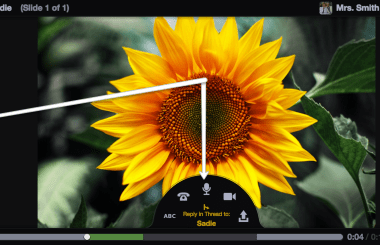
VoiceThread has released a new interface that has some nice changes. If you use VoiceThread in an individual account (or free account), you have the option to use the new VT now. If you are part of an organization that uses VoiceThread, the organizational administrator may make the switch any time between now and this August. In August 2015, the new interface will be implemented for all users.
The 4-minute video above demonstrates:
- The new “Home” page, which takes the place of “My Voice.”
- The uploading interface and editing canvas.
- The new commenting interface.
- How to disable the video countdown.
- How to make a voice recording using the new keyboard shortcut (just press R).
- When you leave more than one comment on a slide using the same Identity, your profile pic/avatar will appear again. This is going to be very helpful for teaching!
- How to move comments simply by clicking and dragging the corresponding avatar. This is a big improvement over needing to press and hold “Shift” while relocating the small gray segments at the bottom of a screen.
New HD Player
One thing I failed to realize while recording the video is that the new VoiceThread uses HD dimensions. As you watch the video, you’ll notice the black bars on the sides of my slides, which are the result of my slides being set to “standard” size (4:3) in Keynote.
 |
| New VoiceThread showing media with a 4:3 ratio. |
I resized my slides to HD (16:9) (which requires some redesign too) and uploaded them again into VoiceThread. The image below displays the HD slide. It’s much more lovely when the image fills the entire viewer.
 |
| New VoiceThread showing media with a 16:9 ratio. |
So, what do you think?
Have questions about the new VoiceThread? Search the new support site here.


